Visual representations of data are powerful ways of conveying information and insights. GiGL is experienced in creating informative and visually effective maps of our raw data and bespoke modelled data. We can also supply alternative ways of data visualisation in the form of tables, charts and infographics which aggregate and summarise data to tell a bigger story. Below are some examples of visualisations we can create for partners and other stakeholders.

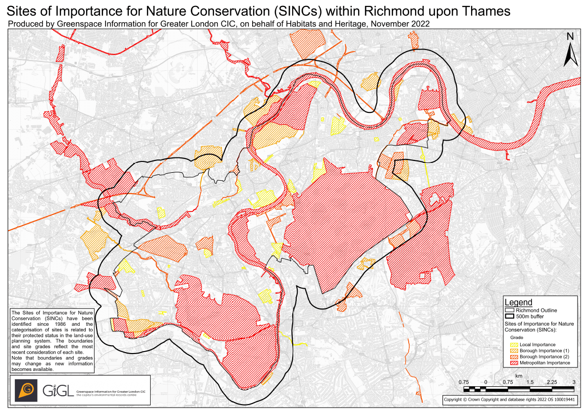
Example SINC map for Richmond upon Thames, Nov 2022

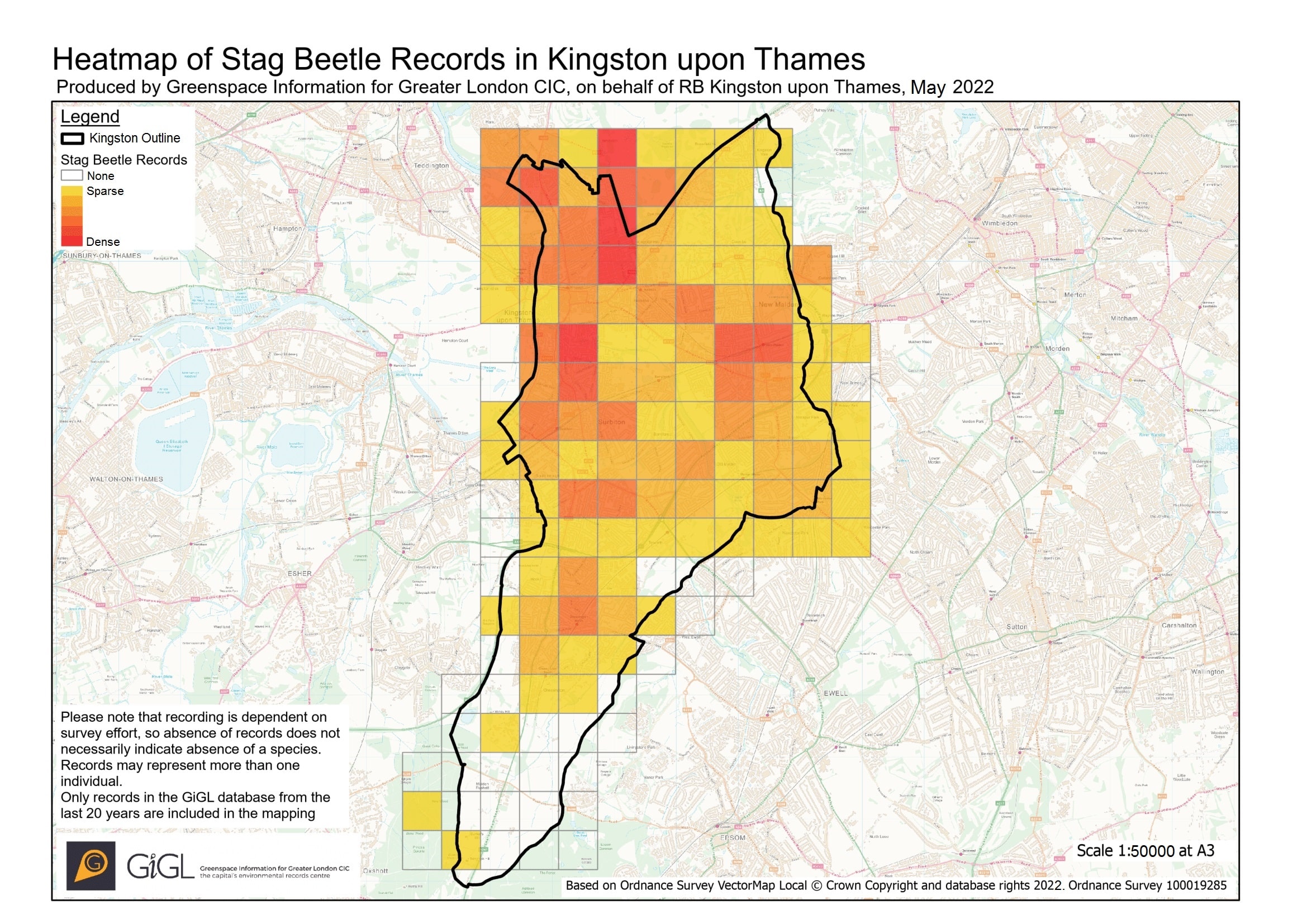
Example Heatmap for Stage Beetle Records in Kingston upon Thames, May 2022

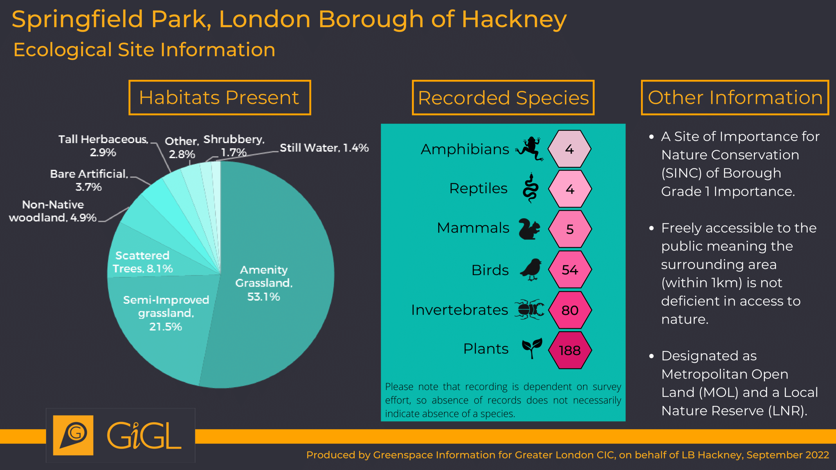
Example Infographic for Springfield Park, Hackney, Sep 2022
You can see some of our visualisation services in action in the following newsletter articles:
- Maps and infographics of London’s parks and open spaces
- Areas of Deficiency in Access to Nature
- Infographics to illustrate borough data informing planning
- Visual gap analysis and distribution of recording
- Ecological corridor mapping
- Advice and input to partnership modelling of ecosystem services
We also share selected data visually via our interactive map Discover-London.
